hi sorry to post a comment on something so old, but i recently got this gui in the sale bundle, and i love it! i was just wondering, maybe for this, if not, future gui packs - if it would be possible do the same "sample/example gui" file/assets as you did with the "pocket inventory" ? (which i also bought, and also love it lol). seeing some premade guis with the asset pack really helped me when making my own. just a suggestion, thanks! :)
I'm in the process of updating older packs and making more packs for older series so i'll be happy to add a handful of example menus! It will have to wait a tiny bit tho, I'm working on too much stuff at the same time atm ToT
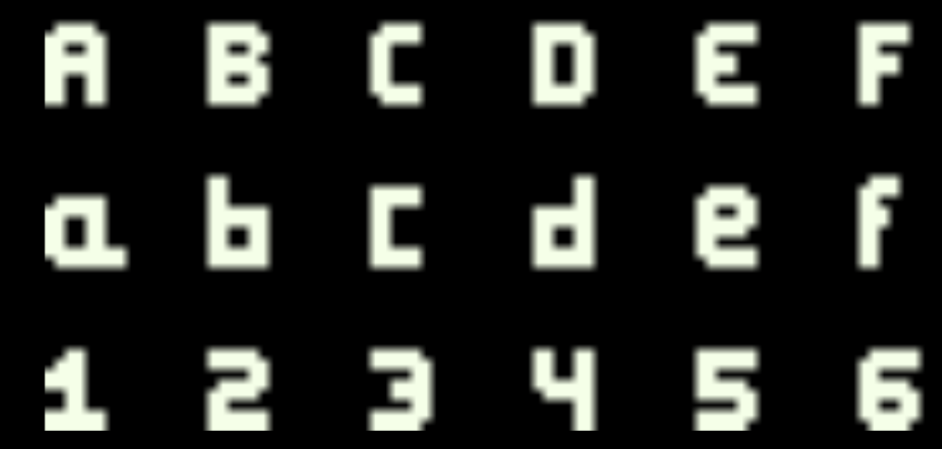
Hi Vryell, thank you for your great work! I'm trying to use the fonts but I noticed that, for every font png left most characters are cropped wrong, also some bottom ones. Can you please upload a corrected version? Also do you have any chance to upload them as tff?
I'm sorry, but this seems to be an error on your end (maybe in the importer?)
As you can see those characters are aligned to the bottom-left of the grid. I'll try to do them as tff in the future but now I don't have that much time :(
It's interesting. I downloaded the .zip file and extracted it. I opened the font png files in different programs (Inkscape, Paint.NET, Windows Image Viewer, Unity) but still I'm seeing characters cropped (You can notice the color transition). Am I doing something wrong? By the way I decided to use another font since using tff is much more easier for me so this is not so much important to me anymore. Sorry for taking your time.
Hi again! I think the issue is in the import method. I don't know much about it, but I think that in unity you have to import pixelart in a specific way or the engine will scale it the wrong way. The windows viewer doesn't work quite good either with pixelart.
Here is a link with a blogpost from unity talking about pixelart: Pixel perfect Unity
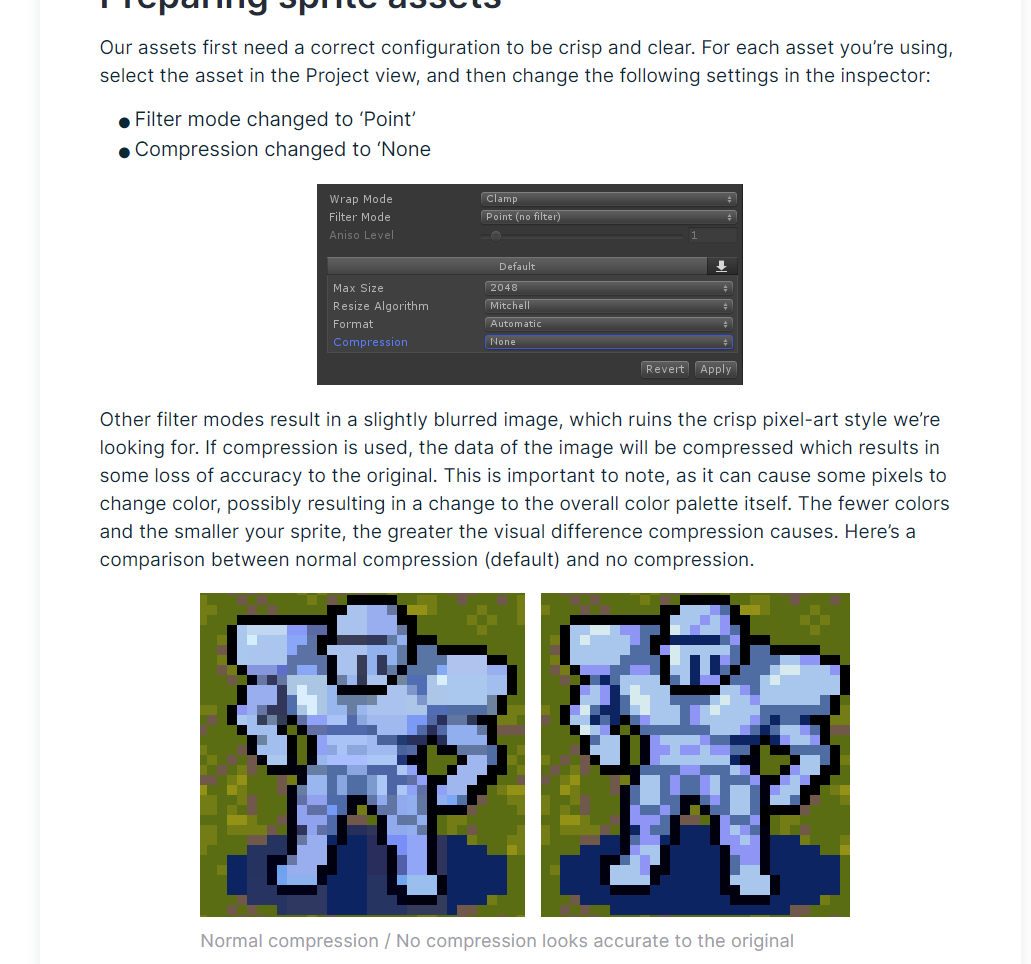
It talks about a lot of things but I think this may be the part that could be useful to you:
I know this is a year old, but I too am running into issues with the font :/ it looks like a very clean font otherwise, but I can't for the life of me get it to work due to its format. If you could still do a ttf format that would be much appreciated! :D
The lifebars are divided in 3 sections: beginning section, mid section and end section. The idea is to use to first use the beginning one, then fill with as many mids as you want and finish it with the end section.:
In this case I've used 1 beginning, 8 mids and 1 end to make a total of 10 hp points.
You can do the same with an empty one and then put one on top of the other, so you just have to cut a part of the one in the front to show the hp change:
I hope this helps you and thanks a lot for your purchase :)
← Return to asset pack
Comments
Log in with itch.io to leave a comment.
hi sorry to post a comment on something so old, but i recently got this gui in the sale bundle, and i love it! i was just wondering, maybe for this, if not, future gui packs - if it would be possible do the same "sample/example gui" file/assets as you did with the "pocket inventory" ? (which i also bought, and also love it lol). seeing some premade guis with the asset pack really helped me when making my own. just a suggestion, thanks! :)
Hi!! No problem, feedback is always welcome.
I'm in the process of updating older packs and making more packs for older series so i'll be happy to add a handful of example menus! It will have to wait a tiny bit tho, I'm working on too much stuff at the same time atm ToT
I used yout work in my 2D game Rune It Out on Steam.
How would you like to be credited? Vryell?
Hey! Congrats on the release!!!
Yup, that should be enough, thanks for crediting me <3
Hello, I purchased your material resources and made a game independently!
Your webpage address is marked on the webpage!
connect:https://panda667.itch.io/acerola-island-story
Hi Vryell, thank you for your great work! I'm trying to use the fonts but I noticed that, for every font png left most characters are cropped wrong, also some bottom ones. Can you please upload a corrected version? Also do you have any chance to upload them as tff?
I'm sorry, but this seems to be an error on your end (maybe in the importer?)
As you can see those characters are aligned to the bottom-left of the grid. I'll try to do them as tff in the future but now I don't have that much time :(
It's interesting. I downloaded the .zip file and extracted it. I opened the font png files in different programs (Inkscape, Paint.NET, Windows Image Viewer, Unity) but still I'm seeing characters cropped (You can notice the color transition). Am I doing something wrong? By the way I decided to use another font since using tff is much more easier for me so this is not so much important to me anymore. Sorry for taking your time.
Hi again!

I think the issue is in the import method. I don't know much about it, but I think that in unity you have to import pixelart in a specific way or the engine will scale it the wrong way. The windows viewer doesn't work quite good either with pixelart.
Here is a link with a blogpost from unity talking about pixelart: Pixel perfect Unity
It talks about a lot of things but I think this may be the part that could be useful to you:
I know this is a year old, but I too am running into issues with the font :/ it looks like a very clean font otherwise, but I can't for the life of me get it to work due to its format. If you could still do a ttf format that would be much appreciated! :D
Hi! Sorry for the inconvenience, I'll check how to do a ttf and update the font, it may take me a couple of days. Thanks for the heads up!
I purchased this and would like to implement lifebar. But I don't know how to cut and implement this. Tell me more about lifebar.png.
Hi!
The lifebars are divided in 3 sections: beginning section, mid section and end section.
The idea is to use to first use the beginning one, then fill with as many mids as you want and finish it with the end section.:
In this case I've used 1 beginning, 8 mids and 1 end to make a total of 10 hp points.
You can do the same with an empty one and then put one on top of the other, so you just have to cut a part of the one in the front to show the hp change:
I hope this helps you and thanks a lot for your purchase :)
I was wondering the same, thx for the informations!
Nice stuff! I'm learning how to make games with Godot and I got the other packs you made, it's pretty swell :)
Thanks a lot! I hope you find them useful.
Best of luck with your gamedev journey :D